


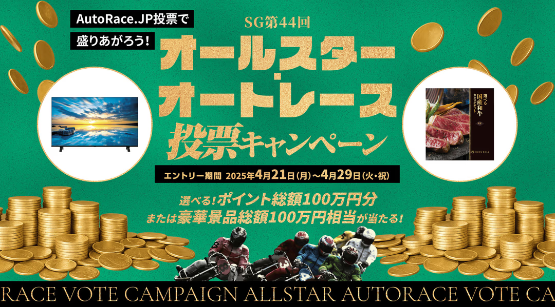
Project Overview
This project is a special campaign page (LP) aimed at promoting the use of the official voting site "AutoRace.JP Voting" in conjunction with the "SG 44th All-Star Auto Race". The target audience consists of existing voting members and potential auto race fans, with the aim of clearly presenting incentives such as luxurious prizes and point rewards to guide them towards entry (conversion).
In this project, I was responsible for overall front-end development. From information design to responsive implementation and interaction realization, I focused on development that prioritized user experience.
Technology Stack Used
- HTML5
- CSS3
- JavaScript (ES6)
- jQuery
- Google Tag Manager (GTM)
- Adobe Fonts (Typekit) / Google Fonts
I selected these technologies and built a modern and efficient development environment that meets the campaign's requirements, while leveraging existing site assets (common CSS/JS).
My Design and Implementation Principles
Responsive Design Optimized for All Devices
To maximize the campaign's appeal, I thoroughly implemented responsive design to ensure optimal information display on all devices, from smartphones to PCs.
Specifically, utility classes such as .sp_none (hidden on smartphones) and .pc_none (hidden on PCs) were utilized to switch main visuals and illustrative images to the optimal ones for each device. This not only goes beyond simple layout adjustments but also achieves both optimal visibility and data transfer optimization tailored to the screen size of each device.
UI/UX and User Flow Design to Maximize Conversions
The user's goal is "entry into the campaign". To achieve this conversion, I designed the UI by anticipating user behavior.
- Strategic CTA Placement: Entry buttons (CTAs) with the
.btn_entryclass were strategically placed at multiple points where users are likely to understand the campaign content and feel motivated to enter (immediately after the overview, after detailed conditions, after prize introductions). This ensured a user flow that prevents missed opportunities, allowing users to take action immediately the moment they think "I want to enter". - Structured Information Provision: The entire page was divided into sections with logical IDs such as
#about,#prize, and#terms, and heading tags such as<h2>and<h3>were used appropriately. This not only made it easier for users to understand the information but also ensured accessibility (a11y) for search engines and assistive technologies.
CSS Design Ensuring Maintainability and Consistency
In this project, destyle.css was first introduced to reset default style differences between browsers and establish a consistent design foundation.
Building on that, cascading based on page section IDs (e.g., #prize) was adopted, and reusable utility classes such as .inner (centering) and .btn_entry (common button) were combined in the design. This allowed for proper management of style scope and achieved highly maintainable CSS that can be applied to future campaign page developments.