


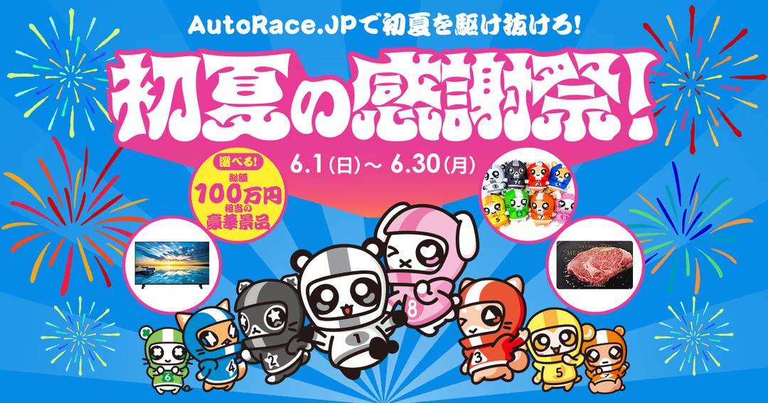
Project Overview and Role
This project involved the creation of a special landing page (LP) for the "Early Summer Appreciation Festival" campaign hosted by "AutoRace.JP," an online betting site for auto racing. The aim was to convey the appeal of a campaign offering luxurious prizes worth a total of 1 million yen to existing and new betting members, and to encourage their participation.
In this project, I was responsible for all aspects of front-end development. I understood the design intent and completed the UI design and implementation to maximize user engagement.
Technologies Adopted
- HTML5
- CSS3
- JavaScript (jQuery)
- Adobe Fonts (Typekit) / Google Fonts
- Google Tag Manager
These technologies were selected to build a modern and highly appealing campaign page, while also absorbing display differences between browsers (through the introduction of destyle.css).
Careful Design and Implementation
1. Device-Optimized Responsive UI
As this campaign anticipates access from both PCs and smartphones, responsive design was meticulously implemented. Especially for LPs where visuals are crucial, a design was adopted to display the optimal image for each device.
Specifically, by using control classes like sp_none / pc_none, high-resolution landscape images are displayed on PCs, and optimized portrait images (e.g., fv.png and fv_s.png) are clearly switched on smartphones, aiming to achieve both a comfortable user experience and display performance.
2. Enhanced Visuals and Typography for Appeal
To convey the festive atmosphere of the campaign, highly designed image headings (h1, h2) were adopted. At that time, alt attributes were set with accurate text, ensuring design quality while also implementing markup that considers accessibility and SEO.
Furthermore, by using Adobe Fonts (Typekit) and Google Fonts in conjunction, rich typography aligned with the brand image was achieved. This allows text information to function as part of the visual appeal.
3. Design with SNS Promotion and Data Measurement in Mind
To maximize campaign awareness, detailed OGP (Open Graph Protocol) and Twitter Card meta tags were set, keeping SNS sharing in mind. This ensures that when shared on platforms like LINE or X (formerly Twitter), attractive images and titles are displayed, contributing to an increased click-through rate.
Furthermore, Google Tag Manager was introduced to build an environment where access analysis and ad effectiveness measurement tags can be centrally managed. This technically supports the campaign's PDCA cycle.
4. UI Design for Maintaining User Flow
The campaign page includes links to existing AutoRace.JP sites, such as the member information confirmation page. For these external links, target="_blank" was appropriately set, allowing users to check related information without leaving the current page. A smooth user experience was designed to avoid hindering the entry flow.