

Project Overview and Role
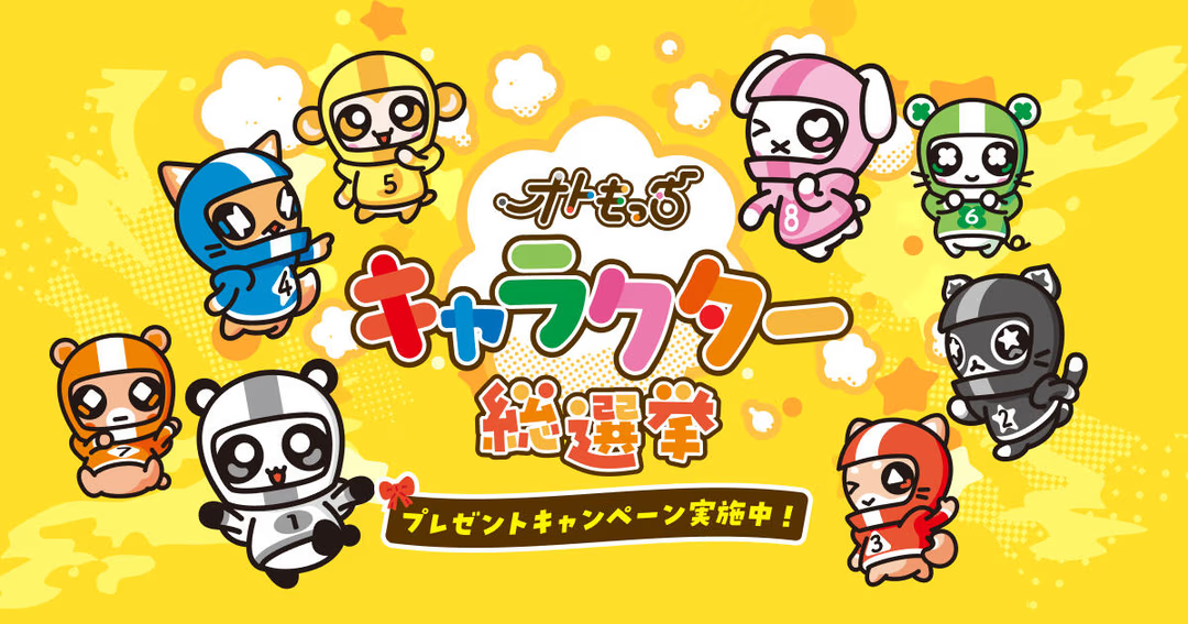
This project is a special campaign site for hosting a popularity poll event for AutoRace's (AutoRace.JP) official mascot character "Otomocchi". Targeting AutoRace fans and character fans, its purpose is to promote voting, announce results, and guide users to related present campaigns.
In this project, I was responsible for all aspects of front-end development. I consistently handled everything from information design and UI implementation considering user experience (UX), to ensuring device-agnostic accessibility.
Technologies Adopted
- HTML5
- CSS3 (including reset by destyle.css)
- JavaScript
- Google Tag Manager (GTM)
- Google Fonts
- Adobe Fonts (Typekit)
By selecting these technologies, I built a modern and efficient development environment that eliminates display differences between browsers and allows for rich expressions in line with the brand image.
Design and Implementation I Focused On
1. HTML Structure that Balances Accessibility and SEO
To ensure that users and search engines correctly understand the meaning of the content, I thoroughly implemented semantic HTML markup. Tags such as <main>, <section>, <h2>, <figure>, <dl> were appropriately used to design a logical document structure.
Additionally, I ensured that all images were provided with appropriate alt attributes, and care was taken to accurately convey information to users of screen readers. This is a crucial implementation directly contributing to ensuring accessibility (a11y).
2. Device-Optimized Responsive Design
Due to the nature of this campaign, we assumed that the majority of access would come from smartphones. Therefore, based on a mobile-first philosophy, I precisely implemented responsive design to achieve optimal layout and usability across all devices, from PCs to smartphones.
For the first view (FV) and main images in particular, I utilized the <picture> tag. This allows for displaying images with different resolutions and aspect ratios according to screen size, suppressing unnecessary data transfer, and providing the most beautiful visual experience on each device.
3. OGP Design to Maximize SNS Shares
SNS diffusion is essential for the success of the campaign. I meticulously configured OGP (Open Graph Protocol) and Twitter Cards metadata so that when users share on platforms like X (formerly Twitter) or Facebook, the intended title, description, and appealing image (og:image) are displayed. This design aims to increase click-through rates on SNS and maximize traffic to the site.
4. Balancing Site Performance and Design Quality
To avoid compromising the user experience, I also paid attention to page loading speed. First, I introduced destyle.css to reset unnecessary display differences between browsers and establish a consistent styling foundation. Furthermore, I appropriately loaded web fonts like Noto Sans JP and Poppins (Google Fonts, Adobe Fonts) to achieve highly readable typography while maintaining the brand image.